LED wristbands create the most memorable moments in live events — but only if the right people know they exist. Cosmobands had a world-class physical product and no digital presence to match it. I designed a full multi-page responsive website from scratch: strategy, wireframes, visual direction, 3D art direction, and scroll-driven UI. The result is a live, lead-generating website that converts event organizers into qualified inquiries through immersive storytelling — not feature lists.
The short version
💡 Product Cosmobands — a B2B LED wristband light show solution for events from 100 to 100,000 attendees | 👥 Buyers Event organizers, brand marketers, entertainment production companies, and experiential agencies |
⚠️ Core Problem A high-impact experiential product with no digital presence capable of conveying its energy, scale, or converting enterprise buyers into qualified leads | 🔀 Key Decision Scroll-driven storytelling architecture over a traditional product layout — simulating the live event experience through interaction design |
✅ Outcome Live, fully responsive website adopted by the sales team as a primary lead-generation asset — with 3D product animations and a structured B2B inquiry funnel |
You can't sell awe with a spec sheet.
Cosmobands revenue model depends on enterprise sales — a single event inquiry can represent a contract worth tens of thousands of dollars. The website isn't a brochure; it's a sales enablement tool whose job is to get a decision-maker to submit a form or call the team. The challenge: the product's value lives entirely inside one moment — a synchronized crowd of thousands lighting up in unison. No static screenshot or spec list can make the emotional case for that. The design challenge was fundamentally a narrative one.
The most dangerous outcome wasn't a bad website. It was a mediocre one — a site that informed visitors without convincing them, leaving the sales team spending every call educating instead of closing.
Four buyer types, four distinct objections to resolve:
Event Organizers & Production Companies — Need to visualize the product at their scale. Primary objection: "Will this work for my event type and size?" Use-case breadth and real photography convert them.
Brand Marketing Teams — Evaluating Cosmobands as a campaign activation. Need confidence the product will reflect well on their brand, not cheapen it.
Entertainment & Concert Promoters — Buying an experience, not a gadget. Need social proof from comparable events and clear spec communication.
Creative Agencies — Pitching Cosmobands to their own clients. The website itself becomes part of their pitch deck.
Constraints:
⚡ Physical product — digital had to simulate what can't be shown statically
🌍 Global audience — communicate scale without alienating smaller event buyers
🎬 No in-house motion team — 3D and animation required external collaboration
📐 Full responsive delivery — desktop and mobile with no feature compromise
Competitive audit and insight mapping
I audited LED wristband suppliers and experiential event tech brands to identify where the category was homogeneous enough to create differentiation. Five patterns emerged, each a design opportunity: flat photography on white backgrounds, static spec tables, corporate copy, single bottom CTAs, and sans-serif-only type — cold and functional across the board.
The most important insight: every competitor treats the wristband as a product. The buyer isn't buying a wristband — they're buying a crowd experience. The site needed to sell the crowd, not the hardware.
Two wireframe directions before any visual design
Approach A — Scroll-driven storytelling (selected): Immersive dark environment from first viewport. 3D product model as the central recurring element. Fluid narrative flow. Multiple CTAs at intent peaks. Hypothesis: experiential products need experiential websites.
Approach B — Traditional product layout (not selected): Feature grid, spec tables, rigid headings, single bottom CTA. Risk: reads like a brochure — looks exactly like every competitor.
Both were presented framed around conversion goals, not aesthetic style. The framing shifted the decision from "which looks better" to "which closes more deals."
Five design principles before any screens
Sell the crowd, not the wristband — lead with scale and emotion; show hardware in context.
Every scroll is a story beat — page structure mirrors a show arc: build, climax, resolution.
CTAs match buyer intent — "Enquire Now" at every moment a convinced buyer might act.
Immersion over information — the atmosphere makes buyers feel they're already at an event before reading a spec.
Mobile is a first-class pitch — same conversion architecture on every screen size, no stripped-down fallback.
A complete style guide — type scale, color tokens, spacing, iconography — was produced before any screens, giving the developer a clean implementation spec and eliminating most QA cycles.
Three pages. One conversion system.
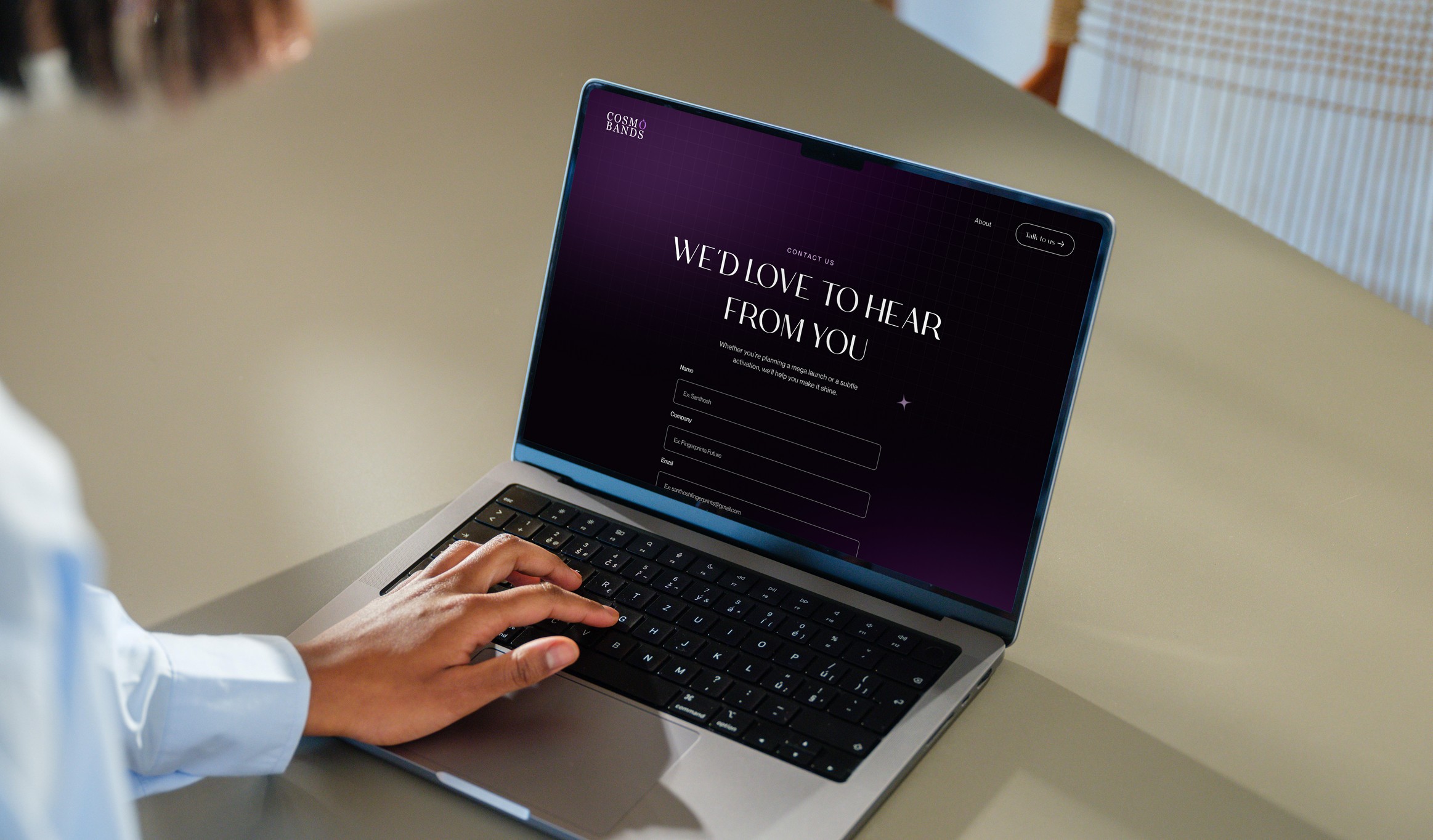
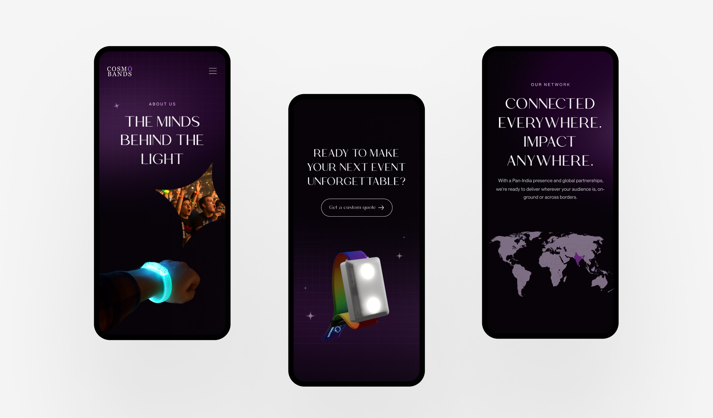
Each page has one primary job: Homepage — inspire and qualify. About — build trust. Contact — close.
Five key design decisions:
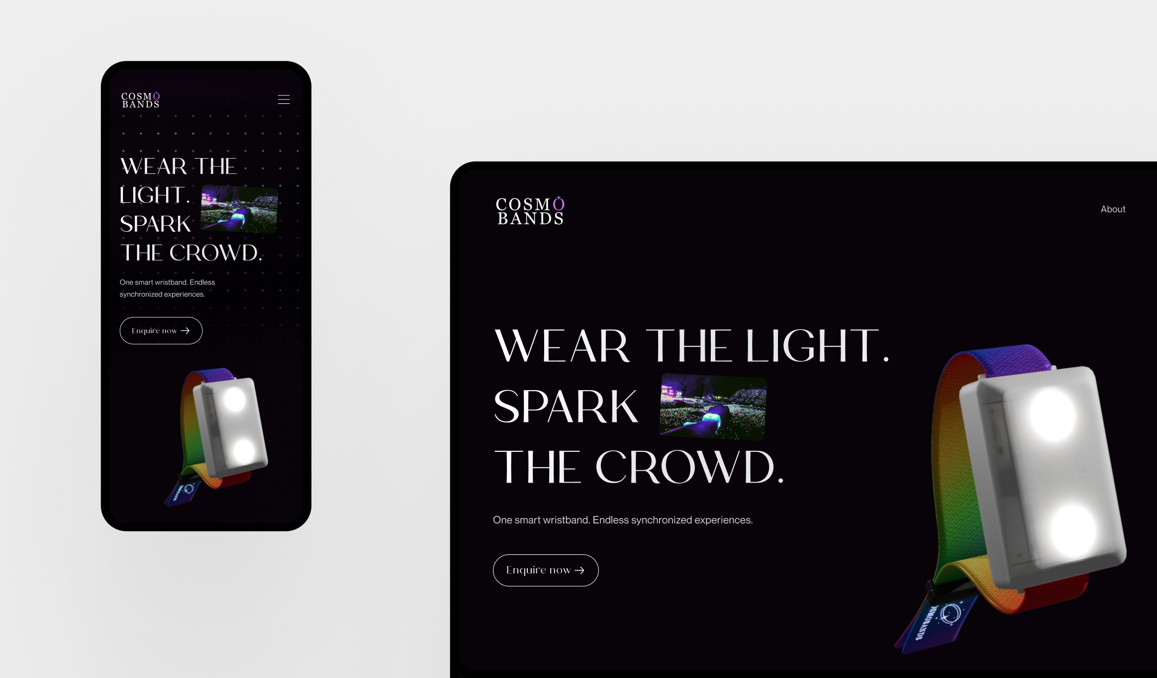
1 — Custom 3D wristband model No existing photography could show the wristband in motion, reacting to light, on dark backgrounds. I commissioned a 3D model and directed the artist through three revision rounds — specifying viewing angles, surface materials, light interaction, and animation triggers. It became the site's most reusable asset, appearing across all three pages. A high-fidelity render signals a high-fidelity product.
2 — Deep dark immersive environment LED wristbands only shine in darkness. A light-background site would undercut the atmospheric quality the product creates at real events. Every text contrast combination was validated against WCAG AA. The payoff: the environment is the pitch — a buyer should feel inside the event before reading a word.
3 — Multi-page architecture A B2B buyer has three distinct needs: understand the product, trust the company, take action. Collapsing all three into one page either rushes trust-building or buries the CTA. Three pages give each job room to breathe.
4 — Serif + sans-serif typographic pairing Every competitor used generic sans-serif type — interchangeable and corporate. The display serif adds drama to headlines like "Wear the Light. Spark the Crowd." — making them feel like a concert poster, not a SaaS page. Typography communicates category leadership before a word is read.
5 — Animation scoped to three high-impact moments Hero 3D entrance, spec reveal, and final CTA pulse. The rest stays static and fast. Animation as punctuation, not wallpaper.
Homepage narrative — 7 deliberate beats:
Hero — 3D entrance + emotional headline + CTA. Goal: create desire in 5 seconds.
How It Works — Video + plain-language explanation. Answers "what is this?" before skepticism sets in.
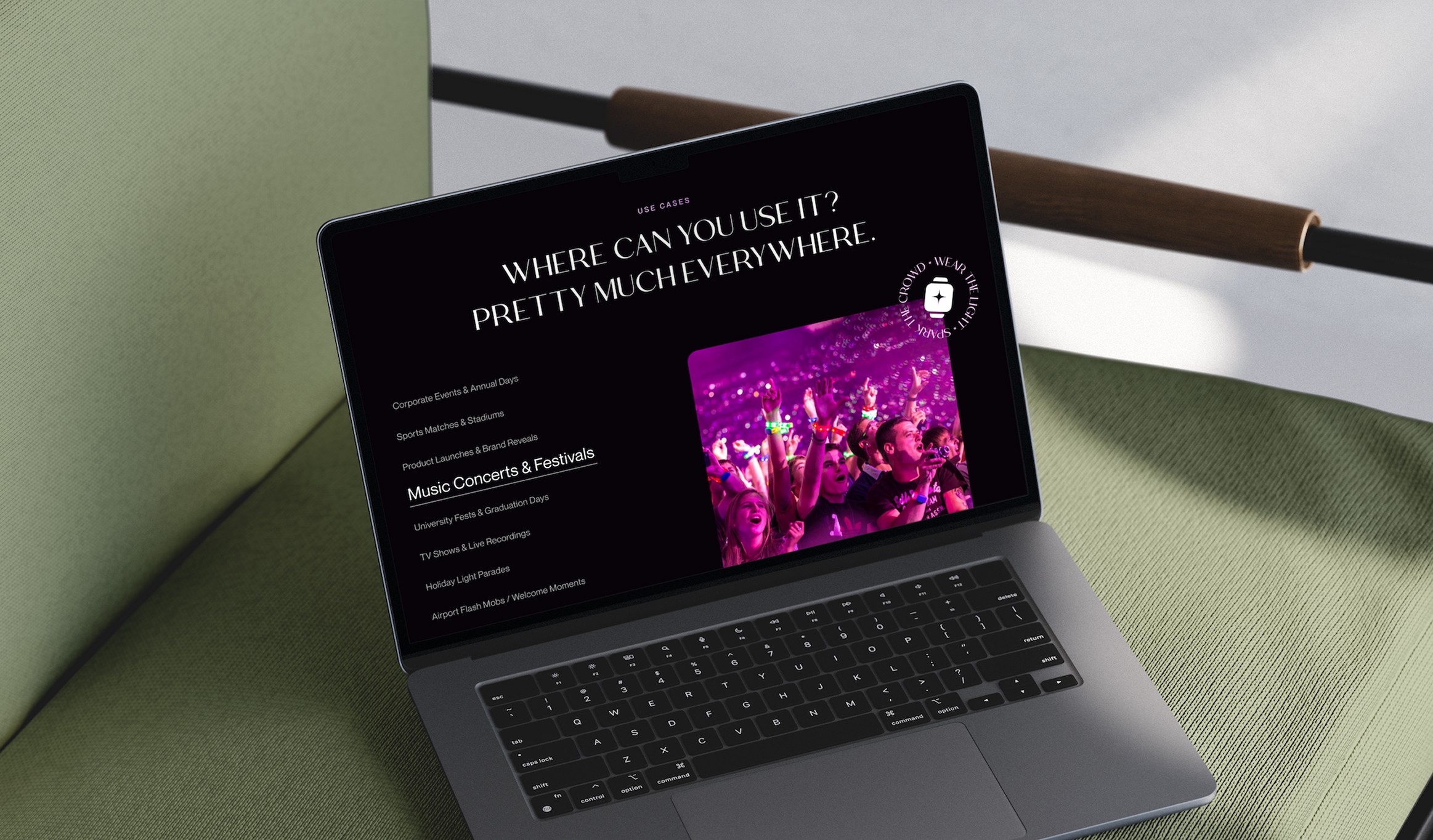
Use Cases — 10 named event categories. Buyers self-qualify by event type without reading everything.
Why Cosmobands — Specs as icon-text pairs. Data without disrupting the narrative.
Control the Crowd's Energy — Five capability cards, each linking to Contact.
Social proof — Testimonials at the moment a buyer is closest to converting.
Final CTA — Full-width close for buyers who've scrolled the complete narrative.
The site is live at cosmobands.com and actively used by the sales team as their primary lead-generation asset — shared directly with prospects as the first touchpoint in the enterprise sales cycle.
Four outcomes:
Business: Replaced a web presence that couldn't support enterprise outreach. The site now qualifies and warms leads before a conversation begins.
Brand: The dark environment and custom 3D model gave Cosmobands a visual identity no direct competitor replicates — closer to luxury event production than commodity tech.
Infrastructure: The style guide, 3D asset, and component library are reusable across future pages and campaigns.
UX: The use-case section removes the "does this work for my event?" objection through design rather than copy.
What this project sharpened
💡 What I learned: Directing a 3D artist for web integration requires a fundamentally different brief than directing a static illustrator — specifying animation timing, file format constraints for web performance, and light interaction behavior. Capabilities I didn't have at the start, and now apply on any project involving 3D or motion assets.
🔧 What I'd do differently: Run 3–5 usability sessions on the Contact page with an event organizer profile — to validate that "Enquire Now" matches how enterprise buyers actually think about initiating a conversation, and whether a budget holder needs to be looped in before submission.
🚀 What I'd add next: A 90-second video case study on the homepage after "How It Works" — real footage closing the imagination gap with evidence rather than design craft alone.
The product is experiential — there is no more convincing argument than a real event organizer describing the moment their crowd lit up in unison. That section would shorten the decision journey from inquiry to signed quote.