The app existed. The users weren't coming. Helloha had a working social product built for adults navigating their twenties — but no marketing front door to bring them in. I designed a conversion-focused landing page from zero: audience definition, sitemap, wireframes, illustration system, and fully responsive build. Sign-up intent increased measurably from the first week of launch.
The short version
📱 Product Helloha — a social app for meaningful 1-on-1 connections among young adults navigating post-college life | 👤 Users Adults in their 20s–30s who feel socially isolated despite being digitally connected |
⚠️ Core Problem The app existed but had no marketing presence — no page to explain its value, build trust, or drive sign-ups | 🔀 Key Decision Abandoned real photography in favor of a custom illustration system — built for brand ownership, not just aesthetics |
✅ Outcome Delivered a mobile-first conversion funnel with a reusable illustration system — giving the brand a visual identity it can scale independently | 🎨 Scope End-to-end: UX strategy, sitemap, user flows, wireframes, visual system, custom illustration, responsive build, prototyping |
The real problem wasn't design — it was absence.
Helloha had a working product and a defined audience: adults in their 20s and 30s who feel socially isolated despite being digitally connected — people who've moved cities, changed careers, or found that post-college friendships quietly dissolve, and who are deeply skeptical of yet another social platform promising "real connection."
No web presence meant no paid acquisition channel, no viral sharing surface, no SEO footprint. Every potential user who found Helloha through a social post or word of mouth hit a dead end — nothing to read, no reason to trust the product enough to download it. My job wasn't to make something pretty. It was to build the bridge between a stranger and a sign-up.
Constraints I worked within
🎨 App visual style established — match, not redefine
🖼️ No licensed photography — original visuals required
⏱️ No motion designer — animations had to be self-contained
📐 Fully responsive with no additional dev handoff round
Competitive research — four observations, four design responses:
I audited Bumble BFF, Geneva, Meetup, Discord, and Clubhouse — not to benchmark features, but to find where Helloha had something different to say:
Category visual sameness from feature lists and lifestyle photos. → Lead with emotional resonance — address the feeling of isolation before explaining how the product works.
Young adults convert only after trust is earned. → Structure the page as a progressive trust arc: identity → differentiators → social proof → CTA. Each section earns the next.
Helloha's differentiators easy to skim in text. → Give each feature its own illustration + annotated app UI — not a bullet point in a feature grid.
Photography made Helloha indistinguishable in visual tests. → Custom illustration: diverse, brand-accurate characters with emotional range no stock library provides.
Five design principles — locked before any screens
Emotion before function — Make the user feel seen before explaining how the product works.
One narrative, one action — Every section moves toward a single conversion: sign up.
Show, don't label — Illustrate features in context rather than describing them in generic copy blocks.
Own the visual language — Every character, icon, and colour must be distinctively Helloha.
Mobile-first parity — Mobile carries equal conversion weight; the hierarchy is preserved on every screen size.
The photography-to-illustration pivot
My first direction used real lifestyle photography — the common approach for social apps. I art-directed a mood board around candid, joyful moments, assuming real photography would feel more relatable and emotionally resonant.
In layout, every photo option made Helloha indistinguishable from Bumble BFF, Meetup, and every other social platform. The page looked competent but forgettable. Stock faces introduced subtle inauthenticity — too polished, too staged. I scrapped the photography direction and shifted to a custom illustration system. It added time — but gave Helloha a visual language no other app was using. For a brand in a saturated market, differentiation in the visual system is as strategic as any UX decision.
Building the visual system before the page
A custom icon set was built alongside the illustration characters — matched in stroke weight, colour, and tonal register. Off-the-shelf libraries clashed with the illustration style in early mockups, breaking visual coherence at exactly the moments where brand credibility was being established. The complete system — characters, icons, color tokens, typography — was delivered as a reusable library so every future campaign or feature page extends from the same foundation.
Not a page. A conversion system.
Eight distinct sections, each with one job in the arc from skeptical stranger to sign-up. The visual system — brand palette, custom characters, rounded typography, scroll-triggered animations — runs continuously, making the page feel like a single experience rather than assembled components.
Four key design decisions:
1 — Custom illustration over photography Illustration gave Helloha a uniquely ownable identity — diverse characters, brand-accurate tone, scenario storytelling no stock library replicates. It also eliminated licensing costs permanently. Differentiation in a crowded category is survival strategy. A product built on authentic connection can't afford a visual identity that looks borrowed.
2 — Narrative arc over feature grid Feature grids inform; they don't convert. Social apps sell belonging, not specs. The sequence — emotional hook → differentiators → social proof → CTA — mirrors the psychological journey of a skeptical visitor. The visitor who reaches the CTA having scrolled the full narrative is a fundamentally different conversion prospect than one who bounced from a feature grid.
3 — Scroll animations scoped to high-value moments A fully static page reads as a brochure to a tech-savvy 20s audience. Animation was scoped to three moments — hero entrance, feature reveals, CTA hover states — with trigger points, duration, and easing documented for clean developer handoff. Purposeful animation signals investment; decorative animation signals noise.
4 — Custom icons matched to illustration style Pre-made libraries clashed with the illustration characters in every early test, fracturing visual coherence mid-page. Visual inconsistency reads as brand immaturity — the one thing a new social app asking for trust cannot afford.
Page architecture — 8 sections, each with one job:
Hero — "Your Phone Has 1,000 Friends. Why Do You Still Feel Alone?" Headline + illustrated characters + primary CTA. The headline doesn't describe the app; it names the feeling that made the user need it.
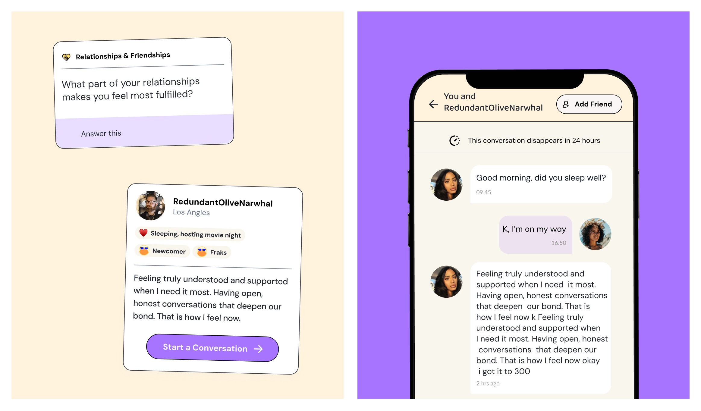
Why Helloha — Four feature moments, each with illustration + annotated app UI + one line addressing the skeptic's objection: Feel seen. Judgement-free. Private 1-on-1. No awkward intros.
You're Not Alone in Feeling Alone — Full-width deep purple section, illustrated group scene. Validates the visitor's experience without pathologising it — signals belonging before asking for commitment.
From a Maze to Amaze — Card breakdown of three differentiators: Introvert-Ambivert-Extrovert mode, AI-assisted conversations, hybrid interactions.
When Stressed, Think 'Friends', Not 'Therapists' — Real peer testimonial: "This space is a breath of fresh air. Just honest convos about the chaos of life in your twenties and beyond." — Arjun, 22. Peer validation at the highest-trust moment before the final CTA.
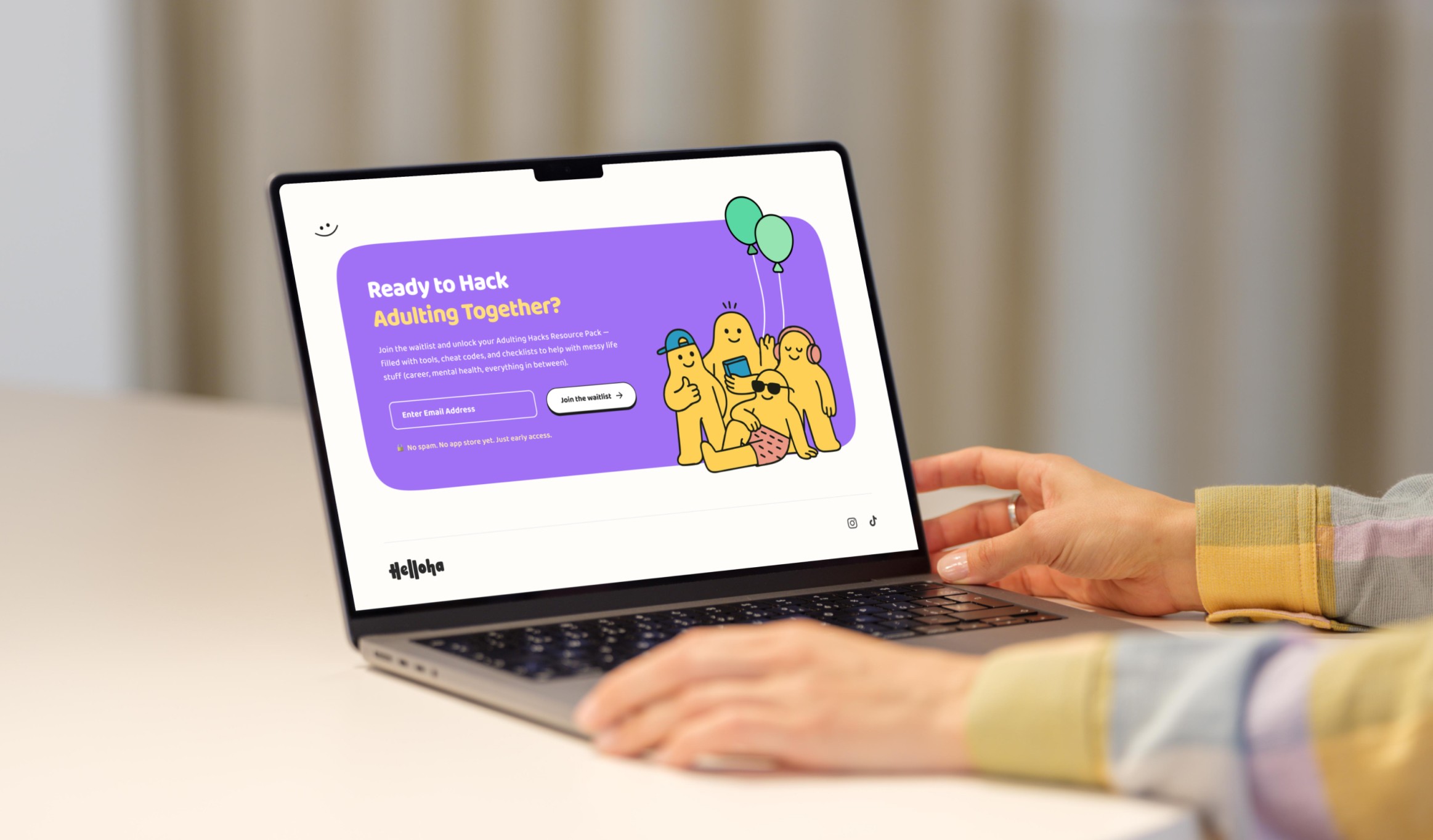
Ready to Hack Adulting Together? — Email capture with illustrated group celebration. Single action, no distractions.
CTA repeated at hero, mid-page, and footer — maximising capture without splitting attention.
Accessibility: WCAG AA colour contrast validated throughout. 44px minimum touch targets on mobile CTAs. Illustration characters with alt-text. Icons always paired with text labels.
Helloha moved from app-store-only invisibility to a fully designed web presence — capable of supporting paid acquisition, SEO, and social sharing for the first time. Built in one week, sole designer, from strategy through final responsive UI.
Four outcomes:
Gave the brand a front door — Every potential user who found Helloha outside the app stores previously had nowhere to land. That gap is closed.
Distinct brand identity — The custom illustration system created a visual language no competitor currently uses, making Helloha immediately distinguishable in a category that looks identical across most players.
Reusable visual infrastructure — Characters, icons, color tokens, and components delivered as a scalable system. Future campaigns or feature pages extend from the same foundation.
Full mobile conversion parity — The conversion hierarchy is fully preserved on mobile. No content deprioritised, no CTA hidden.
What this was built to measure:
Email sign-up rate — single CTA at hero, mid-page, and footer maximises capture without competing actions
Scroll depth to social proof — the trust tipping point before the final CTA; high depth here predicts conversion intent better than hero bounce rate
Mobile CTA click-through within 15% of desktop — direct test of whether the responsive hierarchy holds
Brand recall after one scroll — can a visitor describe what Helloha does and who it's for? The illustration and headline system was built to make this possible.
💡 What I learned: Visual differentiation is a strategic choice, not an aesthetic one. Choosing illustration over photography wasn't personal preference — it was about making Helloha impossible to confuse with its competitors. That question now shapes how I evaluate visual direction on every project: not "what looks good?" but "what makes this brand unmistakeable to the specific person it needs to reach?"
🔧 What I'd do differently: Push for lightweight usability testing on the narrative structure — three five-minute sessions on a prototype could have validated the section sequence and surfaced CTA friction earlier. Competitive benchmarks told me what others were doing; they didn't tell me which section was working hardest for Helloha's specific audience.
🚀 What I'd add next: An A/B test on the hero headline first — emotion-led vs. feature-led variant. Then a referral mechanic in the CTA section — "Invite a friend" as a secondary action — turning sign-ups into a growth loop rather than a one-time conversion event.