A luxury watch retailer had an outdated website that undersold a premium brand — and no backend system capable of managing the volume of inventory, inquiries, and editorial content the business ran on. I redesigned the full customer-facing website across nine pages and designed the CMS backend from scratch: two products, two distinct user types, one coherent system. The result elevates the brand's digital presence to match its physical reputation while giving the team the operational infrastructure to manage it independently.
The short version
⌚ Product Phoenix Watch Company — a premium pre-owned and new luxury watch retailer based in Hong Kong | 👥 Buyers Two distinct audiences: affluent watch buyers (frontend) and admin staff managing inventory, inquiries, and content (backend) |
⚠️ Core Problem An outdated website that failed to reflect premium positioning, paired with no CMS — forcing manual updates and creating operational bottlenecks | 🎨 My Role End-to-end: UX audit, competitive research, IA, 4 homepage concepts, full UI for 9 pages, complete style guide, and CMS backend across 7 modules |
🔀 Key Decision Designed frontend and backend as a unified product system — same brand language, different interaction paradigms — ensuring operational coherence, not just visual consistency | ✅ Outcome
|
Two products. One brand. Both broken.
Phoenix Watch Company occupies a specific niche in Hong Kong's luxury goods market — a trusted dealer in authenticated pre-owned and new watches from Rolex, Tag Heuer, Audemars Piguet, and other premier marques. The brand's physical credibility was established. Its digital experience was not keeping pace.
The business had two compounding problems that couldn't be solved independently. The customer-facing website failed to signal the premium positioning that justified its price points. Beneath that, zero CMS infrastructure meant every inventory update, blog post, or inquiry change required developer intervention — content was effectively frozen. Fix one without the other and the remaining problem becomes more visible, not less.
UX audit — five failure areas:
Visual credibility — Generic layout, inconsistent typography, low-quality imagery. First impression failed to justify luxury price points; buyers questioned authenticity before engaging.
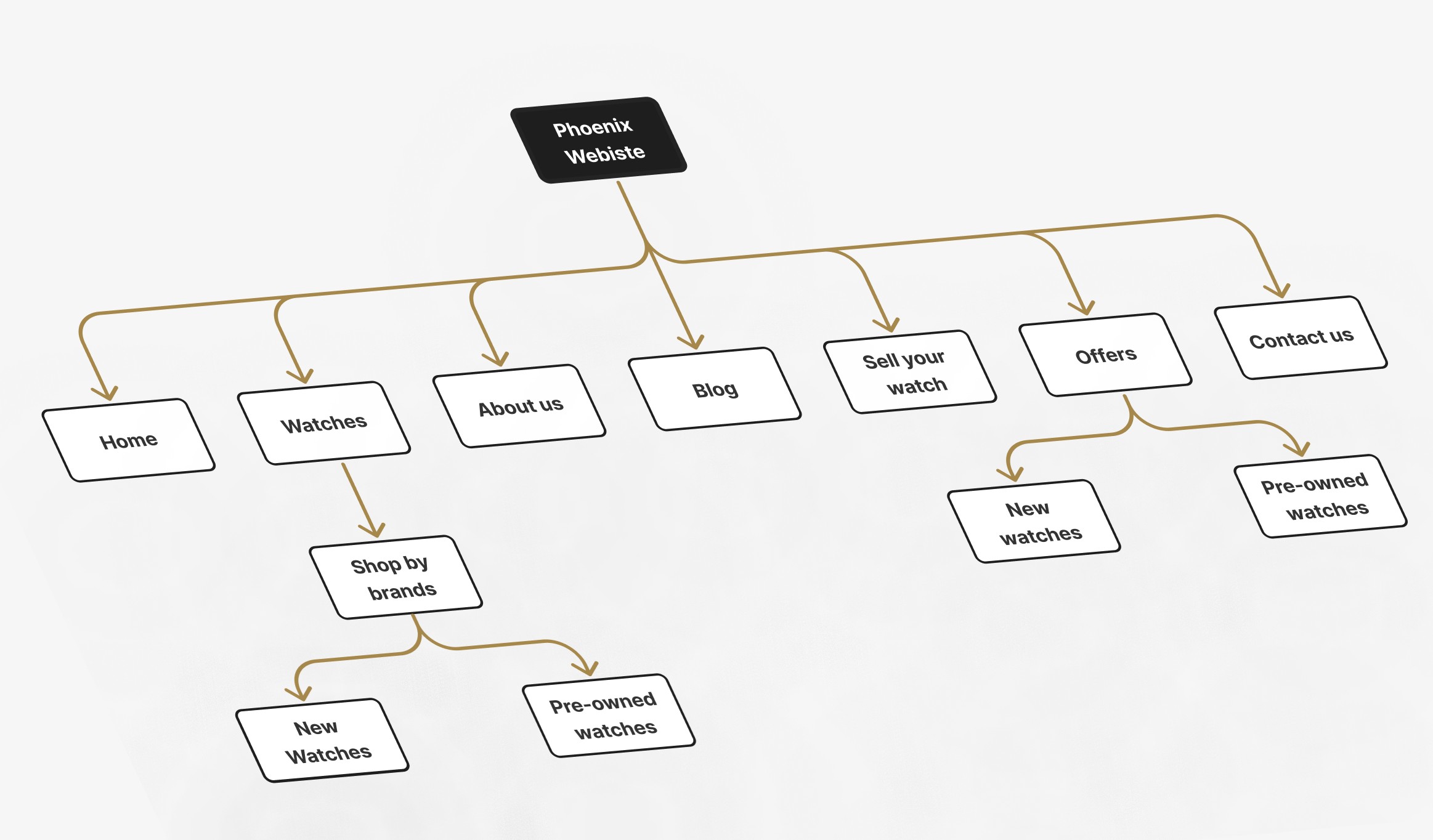
Information architecture — Navigation didn't reflect how buyers browse: by brand, then by model. Qualified buyers couldn't find inventory.
Trust signals — No authentication credentials, testimonials, or brand logos at the moments buyers needed them. In pre-owned, absence of trust signals creates hesitation at the point of highest commitment.
Content operations — No CMS. Blog and inventory were static. Every change required a developer call.
Conversion path — "Sell Your Watch" routed sellers to a generic contact form, producing unqualified inquiries the sales team had to chase before a valuation could begin.
Constraints
⌚ Existing brand identity to enhance, not replace
📦 Large product catalogue — UI had to scale across brands and models
👤 Two user types requiring separate design paradigms
🔒 Non-technical admin staff — efficiency is non-negotiable
🌏 Hong Kong market — international luxury standards, local buyer expectations
Two parallel workstreams — frontend redesign and backend CMS — designed as a unified system from a single shared foundation.
Competitive audit
I audited major luxury watch dealer brands like Watchfinder, Bob's Watches, Chrono24, and boutique Hong Kong dealers. Four observations shaped the direction:
Chrono24's clinical, filter-heavy UX actively undercuts any sense of brand intimacy. Phoenix's direction: editorial-quality photography, restrained layout, win on warmth not catalogue volume.
Watchfinder buries "Sell Your Watch" — a missed opportunity given supply acquisition is as strategically valuable as sales. Phoenix's direction: primary nav item, structured submission page.
Cluttered pages read as discount-tier across the category. Whitespace is a luxury signal.
Pre-owned buyers shop by brand first, then model. Brand navigation must be a first-class path, not buried in filters.
Four homepage concepts — a genuine strategic choice
Before any visual system was defined, I developed four visual direction concepts: Editorial Dark · Minimal Light · Heritage Premium ✓ · Gallery Grid
Why Heritage Premium won — and why my instinct was wrong. My natural pull was toward "Editorial Dark" — premium in isolation, but when shown alongside Hong Kong competitors, the client flagged a local nuance: the dark palette read as aggressive and inaccessible to buyers who associate the lighter, warmer aesthetic with established HK luxury retail. "Heritage Premium" tested as more approachable while retaining the premium signal. The lesson: luxury design principles are culturally inflected. Local client knowledge is a design input, not a preference to override.
The design direction was further refined through several iterative explorations, resulting in a visual language that closely aligned with the brand's objectives and desired market positioning.
Five design principles
Whitespace signals value — restraint communicates price. Every element earns its space.
Image before copy — a watch is a visual object. No spec list replaces a great wrist shot.
Brand as browse mode — the IA serves how buyers actually think: Rolex, then model.
Trust at decision points — authentication credentials and brand logos at the product page and inquiry form.
Two user types, one system — frontend and CMS share typographic DNA and spacing logic; neither compromises for the other.
A complete style guide — type scale, color tokens, spacing, gold accent logic — was produced before any page or module was designed, preventing visual drift across 9 pages and 7 backend modules.
CMS user mapping
Before any backend screen, I mapped admin tasks by frequency and consequence. Watch Management received the deepest design investment — it's the highest-frequency task with the highest error consequences. Getting a Rolex Submariner listing wrong has direct revenue impact; that shaped every decision from field order to status logic.
9 pages. 7 modules. One coherent system.
Three key frontend decisions:
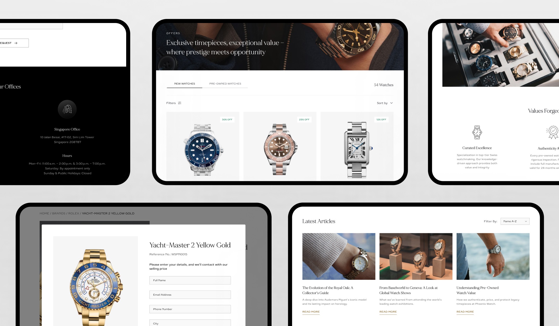
1 — Full-bleed video hero over static photography Video communicates the kinetic pleasure of a watch on the wrist — movement, light on the case — in a way static can't. Scoped to an 8–12 second loop with a static fallback. The opening experience is distinct from any catalogue-style competitor before a word of copy is read.
2 — "Shop by Brand" as a homepage-level element, not a filter Brand logo recognition triggers faster decision-making than product images in this category. Buyers who arrive brand-committed — the majority — convert faster from a direct brand link than from filtered search. The brand grid is the conversion mechanism, not just a navigation aid.
3 — "Sell Your Watch" as a structured multi-field form The existing flow sent sellers to a generic contact form. The redesigned form captures brand, model, reference number, condition, asking price, and photos upfront — every submission arrives pre-qualified for a first-pass valuation before the first call. Motivated sellers complete a longer form; the sales team stops chasing basic information.
9-page website architecture:
Homepage — Video hero + brand logo grid + featured listings + trust signals
Our Story — Editorial layout with authentication credentials prominently featured
Contact Us — Inquiry form + Location + phone + hours in one place + FAQ
Blog — Magazine-style grid with featured article and category filters
Blog Detail — Long-form layout with pull quotes and in-article product CTAs
Shop by Brand — Brand-filtered grid with sort controls and consistent card sizing, and seamless switching between New and Pre-Owned collections.
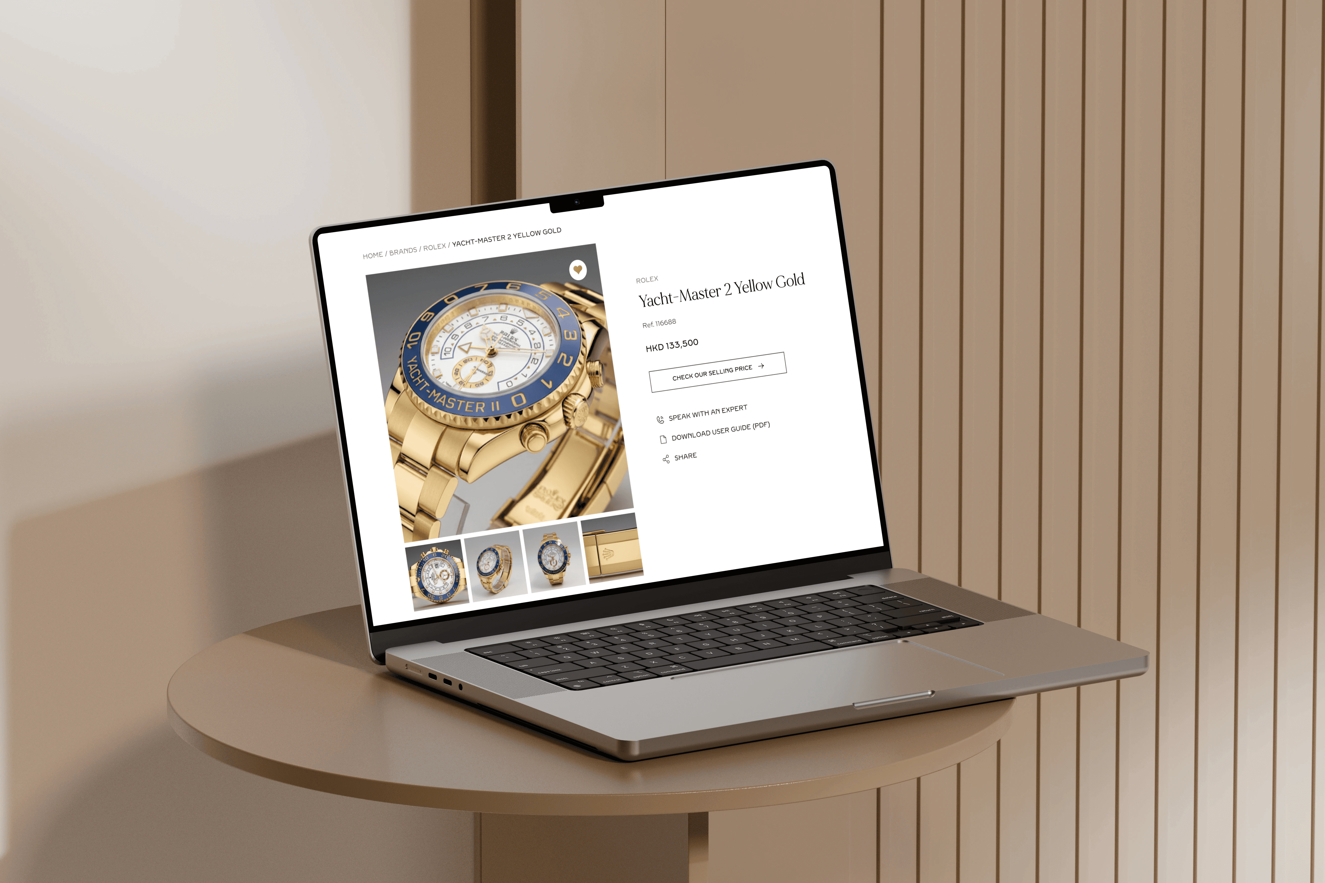
Product Page — Multi-image gallery + spec table + condition notes + authentication badge + Enquire CTA above fold
Offers Page — Offer-led luxury shopping experience with visible savings, gated pricing enquiries, and seamless switching between New and Pre-Owned collections.
Sell Your Watch — Structured multi-step form: What are you selling → Asking price
Three key CMS decisions:
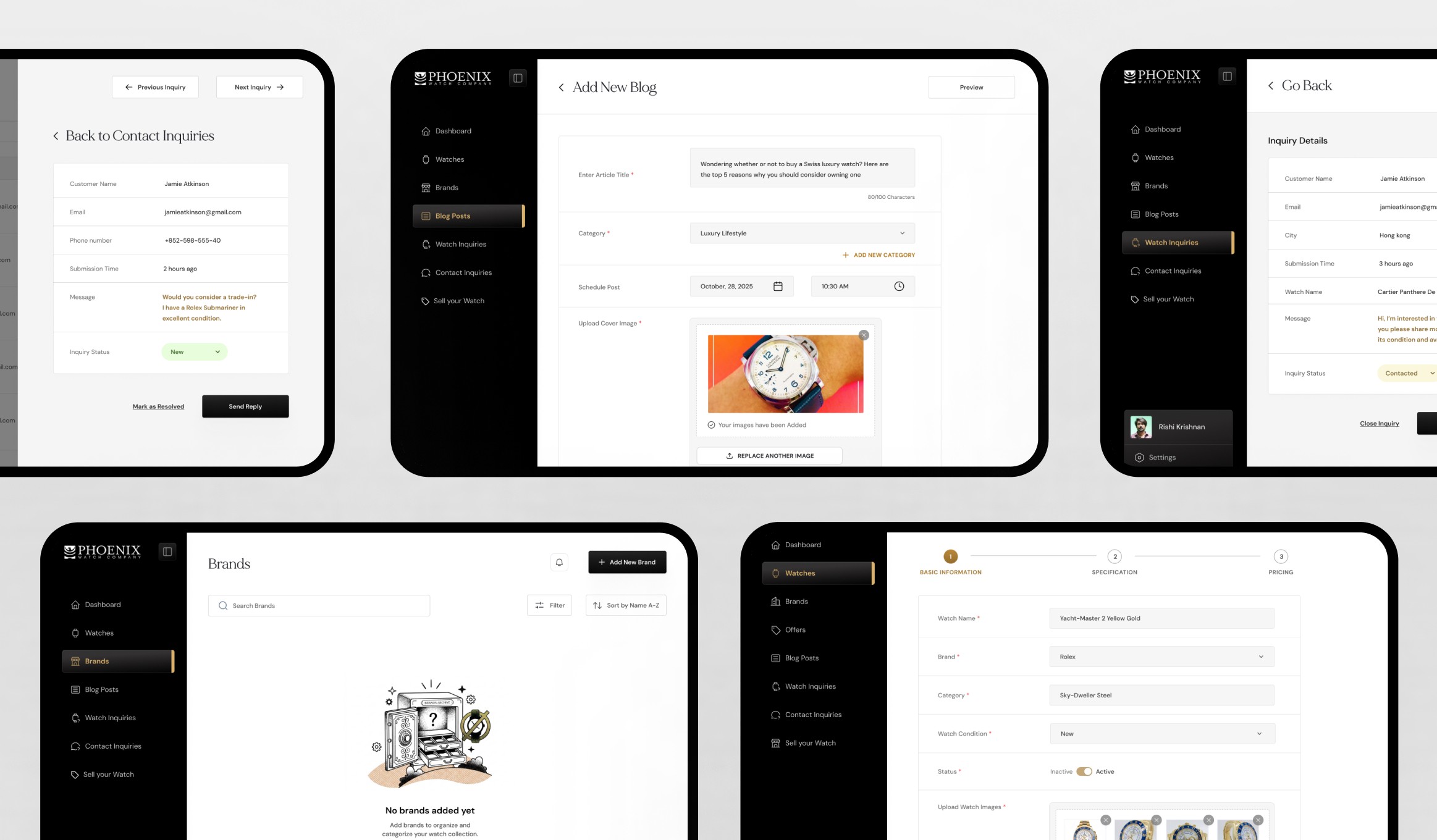
1 — Watch Management as the most complex, highest-investment module Adding a watch requires the most data of any admin task. I used a multi-step form with section grouping — Basic information → Specification→ Pricing — mirroring how a watch professional thinks about a listing. The structure isn't just UX; it's quality control for inventory data.
2 — Adapted light system for the backend The frontend's atmospheric visual system would be fatiguing for an admin doing 3–4 hours of data entry daily. The backend shares the same typeface, spacing, and color tokens — expressed in high-contrast light mode optimised for table density and form legibility. One brand, two functional modes.
3 — Status-tagged inquiry tables with hover quick actions New / Open / Closed badges let an admin read the full inbox state in under 10 seconds. Quick actions appear on row hover only — keeping the table scannable at rest, immediately actionable on focus. No round-trip to a detail page for common tasks.
7-module CMS: Dashboard · Watch Management · Brand Management · Watch Inquiries · Sell Your Watches · Waitlist & Contact Inquiries · Blog Management
The CMS is the more strategically valuable deliverable. Before it, Phoenix's content was frozen — inventory couldn't be updated without a developer call, blog posts required external help, inquiry data lived in someone's inbox. The CMS breaks all three bottlenecks simultaneously. The website redesign improves the buyer experience; the CMS makes it sustainable at scale.
Four outcomes:
Elevated brand perception — The redesign brought the digital experience into alignment with Phoenix's physical credibility.
Eliminated developer dependency — Admin staff can now publish listings, update inventory, and manage inquiries without developer involvement.
Structured lead pipeline — "Sell Your Watch" transformed generic email threads into standardised submissions with first-pass valuation data.
Reusable visual infrastructure — Style guide and design system serve both products. Future pages or modules extend this foundation without starting from scratch.
Project scope: 9 website pages · 7 CMS modules · 4 homepage concepts · 27+ backend screens · 5 weeks solo.
What this project developed in me
💡 What I learned: Designing a frontend and backend simultaneously forced me to think about information architecture as a shared system. The entities defined in the CMS — Watch, Brand, Inquiry, Seller Submission — directly mapped to the page types on the frontend. Starting with that entity model and building both surfaces from it made the project coherent in a way that retrofitting would never have achieved.
🔧 What I'd do differently: I'd insist on user testing with the actual admin team for the CMS Watch Management form — specifically around field order and grouping. I made informed assumptions from task frequency analysis, but a 30-minute session watching an admin enter a real listing would have surfaced edge cases — partial entries, draft states, duplicate detection — that are invisible in wireframe review.
🚀 What I'd build next: A watch valuation tool embedded in the "Sell Your Watch" flow — a structured input system that gives sellers an indicative estimate before they submit the inquiry form. It would increase submission completion rates by reducing the uncertainty sellers feel before committing to the consignment process, and it would pre-qualify inquiry quality for the sales team simultaneously.